|
| Before |
 |
| After |
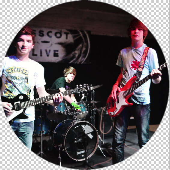
I
unfocused the background, and
drained all background colours. This put all the
focus on the three main subjects and their instruments. I then
sharpened the subjects as I realised they were
slightly out of focus. The reason the guy on the right looks pink was to do with the
stage lighting, and normally I would've changed it, but I wanted to portray the band more
honestly, not airbrushed to perfection. I also managed to select the fire escape and alarm at the back, then use the
clone tool to remove them.
 |
| After |
 |
| Before |
For this second image, I went against the last notion. On the front page, you want something relatively pleasant to look at. I
airbrushed all the creases out of their faces, as it also
removed any pixelation caused by the
changing of the size of the image in the editing process. I then
unfocused the background a lot, so that leg between Will and Dan doesn't get any of the limelight - that leg is unimportant. I also
thought back to the interview at NME, who told us to try and
avoid the colour Black, as it's not as visually engaging, so I
brightened the background. Unfortunately, this created
more pixelation, so I had to
unfocus it more. By the end, it made the three subjects look like they are
glowing, which is a
positive thought, quite
fitting with the way I wanted them to look - happy, unfazed by the Dramas they've experienced. So I kept it.